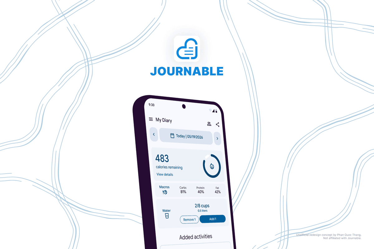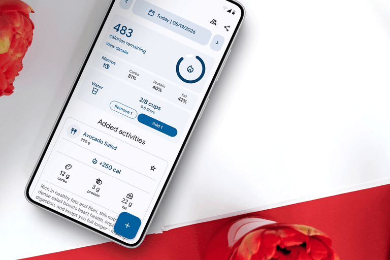
Journable: Eliminating Free Trial Ambiguity
Author: Phan Quoc Thang
- Timeline: Apr 2026 - May 2026
- Platform: Mobile
- My Role: UI/UX Designer
- Tools: Figma

Introduction
Journable is an AI-powered app that helps exercise enthusiasts, food lovers, or anybody who is in need of tracking their macros to log down their food and workouts during a day. The app analyzes users’ activity descriptions, and then responds with corresponding results, either calories intake and other nutritional values (such as protein, carbs, and fat) for meals, or calories burnt for cardio sessions or strength training. Unlike traditional calorie tracking apps, this tool lets you note everything down using plain language (even your native language), just like chatting with friends. This app is available on both the App Store and Google Play.
Problem
Journable includes a paid subscription plan. Upon creating an account, users are given a set number of free trial prompts. This means they can use these first free prompts to see if the app meets their expectations. The primary flow of a user when opening the app includes typing out details about their meal (the prompt can be generic, but a context-rich one can help the app produce a more precise output). Users then wait a few seconds, before the app sends back the calorie and macro breakdown. But, with the current design of the app, users who haven’t subscribed to the premium plan can’t even tell that they are only on free trials, which leads to frustration when users unexpectedly hit a paywall.
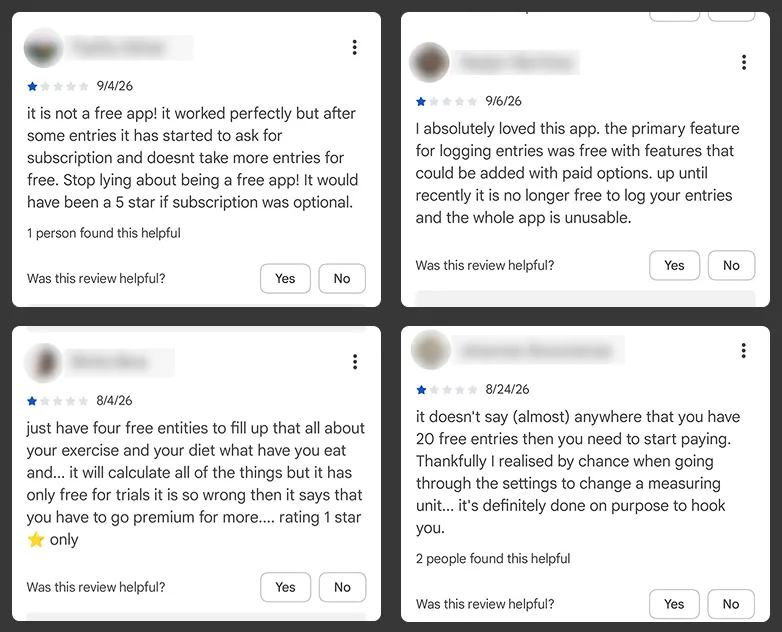
Based on this shared pain point, I wrote out the problem statement to serve as a guide to help me determine what the objective was:
“Paul is a busy father of two who is looking for an easy way to track his meals and clear visibility into his free trial status, because an unannounced paywall can interrupt his daily routine and make him lose trust in the product.”
Goal
My primary focus was to bring the trial status to the forefront. While working on a fix, I also experimented with refining the core layout to create a stronger visual hierarchy, as I noticed that, in general, most of the text and elements lacked readability.
Ideation & Wireframing
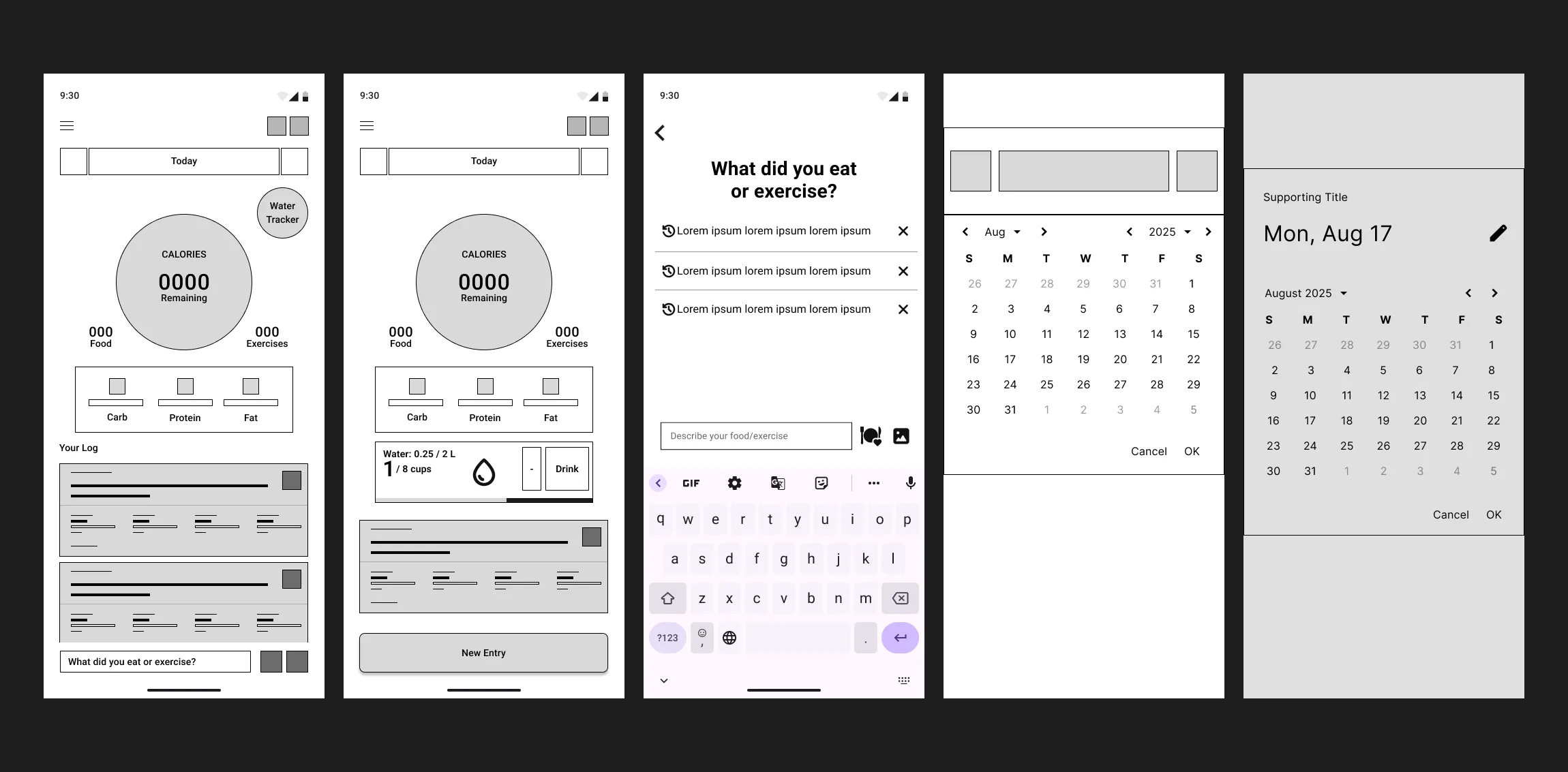
I started with some draft versions on paper, using the Rapid Prototyping method. This helped me go through quick iterations and focus on the quantity of ideas. I tried different approaches for the main page’s layout, as this helped me determine the most effective placement for the free trial status label.
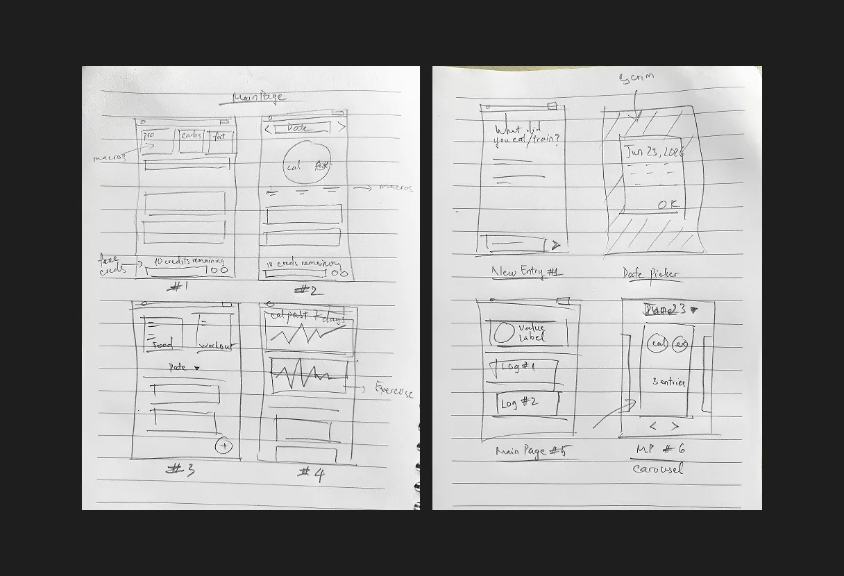
In the final step, I selected my preferred design choices for each section. After that, I brought everything into Figma and created the digital lo-fi wireframes.
Design System & Foundations
My visual design choices were inspired by Material Design 3, an open-source design system by Google. This helped me keep the UI appearance consistent across screens, and served as a guide on designing the components that are easily recognizable.
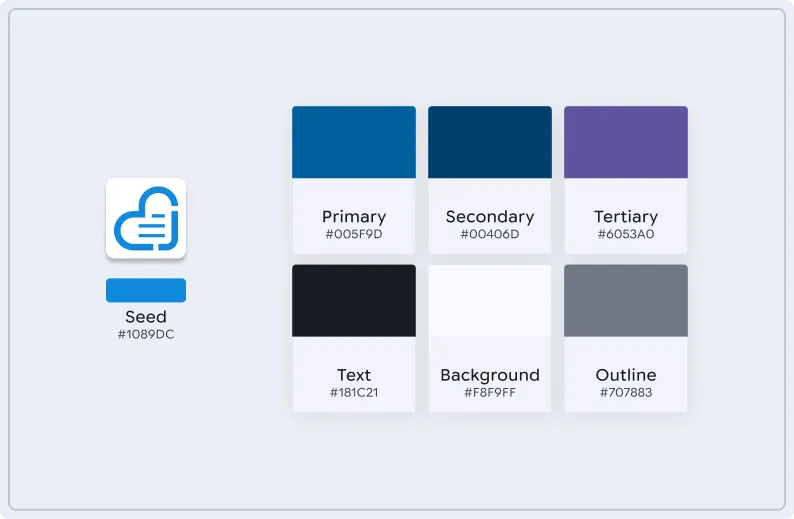
The color tokens were generated with the Material Theme Builder. I picked the color from Journable’s logo as the primary color. From here, the theme builder helped me prepare color tokens with proper WCAG contrast, along with light/dark mode support.
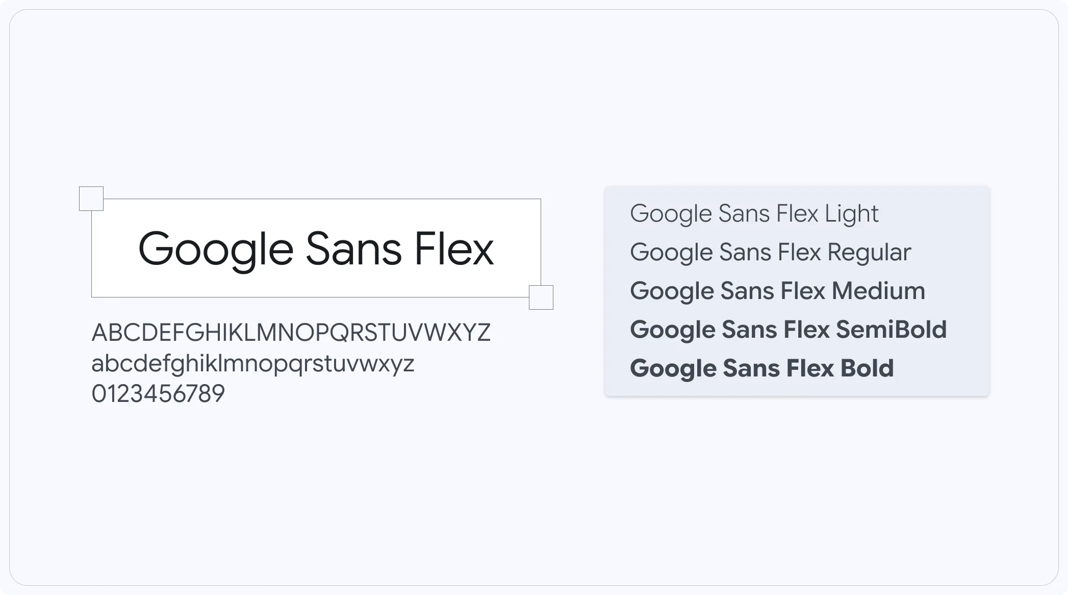
For typography, I chose Google Sans Flex for its modern and approachable look, paired with clear numeric rendering.
High-Fidelity Prototype
Once the lo-fi wireframes were ready, I converted them into hi-fi mockups, applying colors, typography, and visual styling. The screens were linked together into an interactive prototype with smooth transitions.
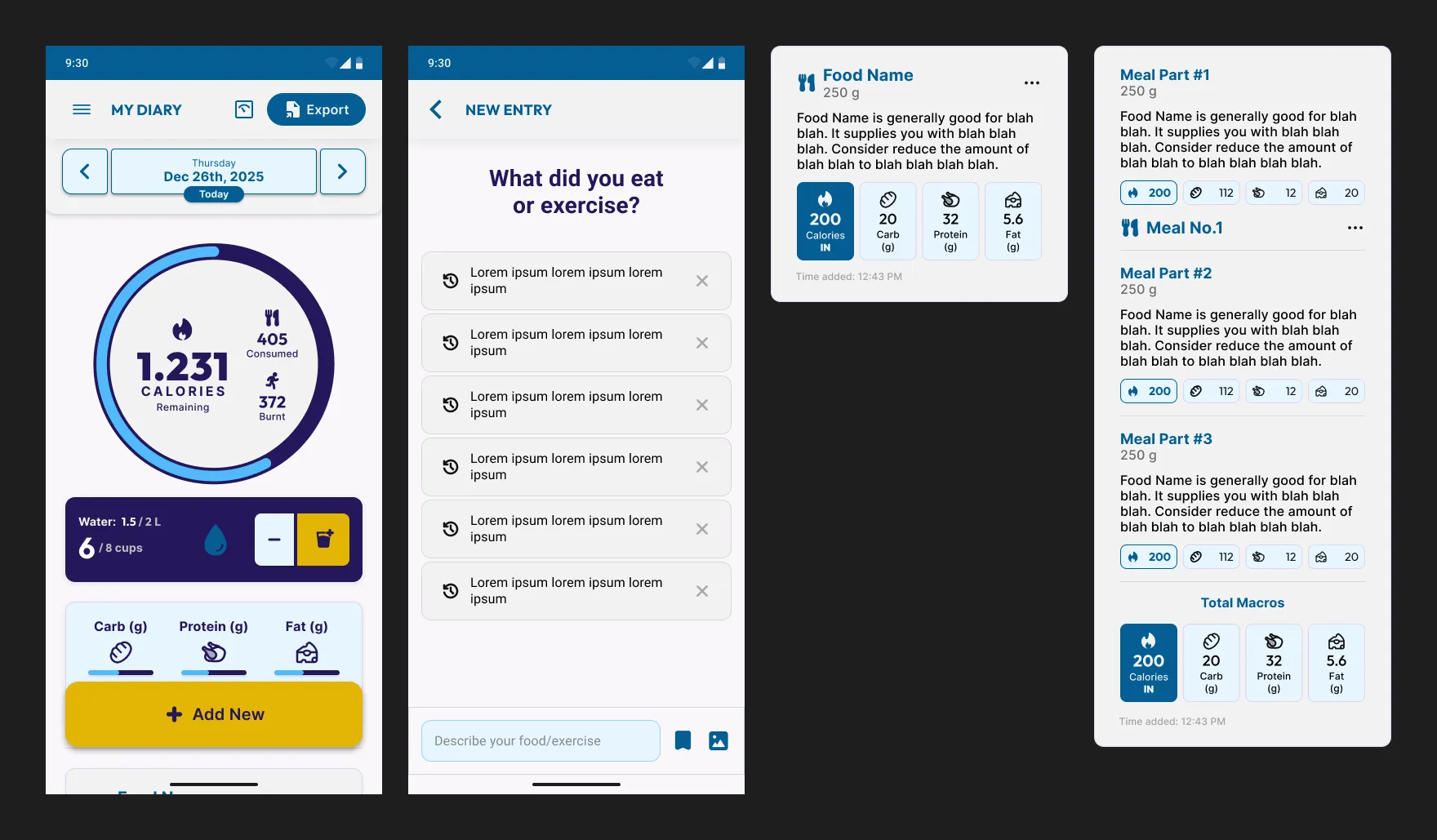
But soon I realized that these mockups weren’t delivering what I wanted, as they were too bold and visually heavy, so I gave them another shot:
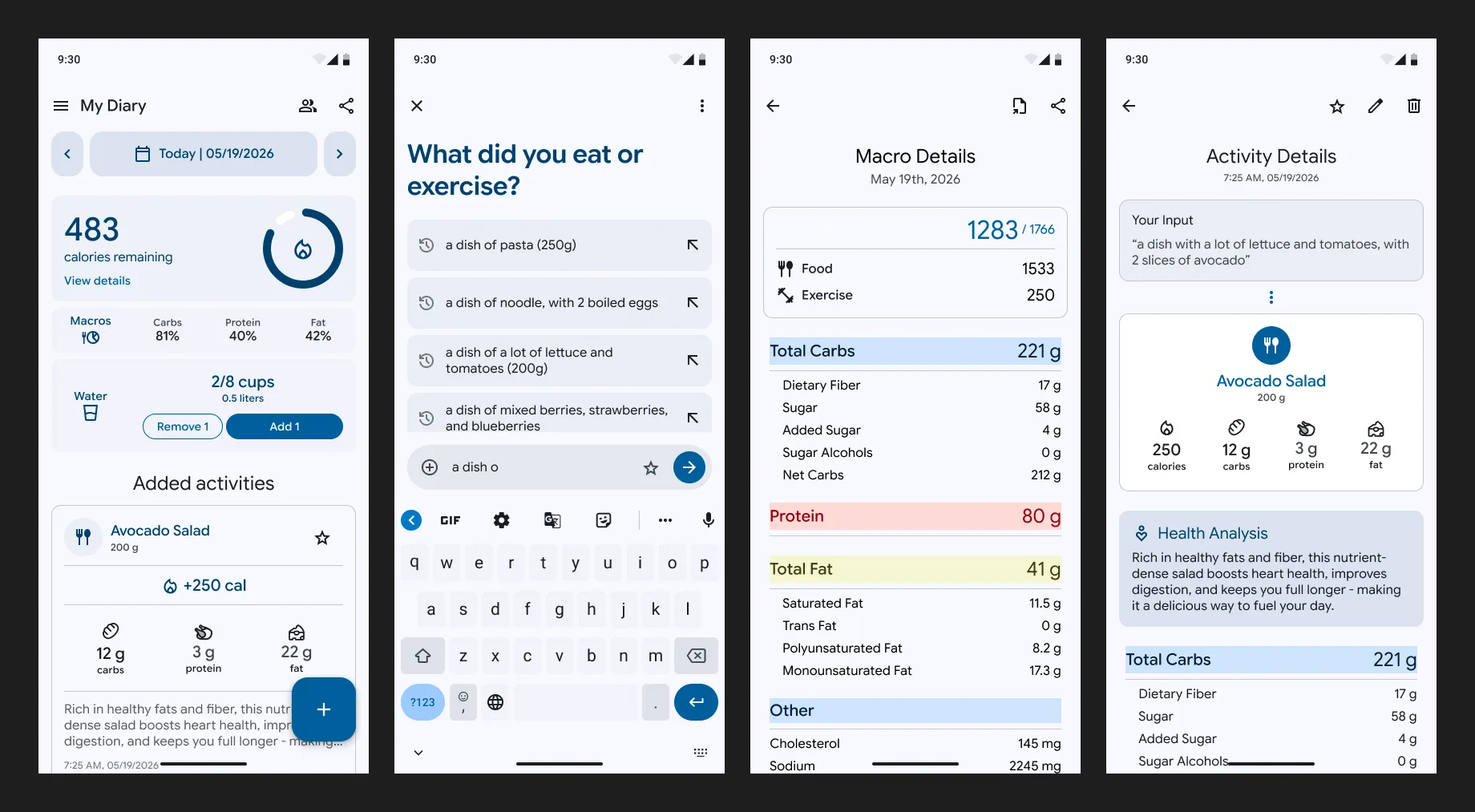
This new version introduced more breathing room in general and reduced the weight of the text labels, which made the screens feel less overwhelming.
Before & After
The image below shows a direct comparison between the original look and my redesigned approach:
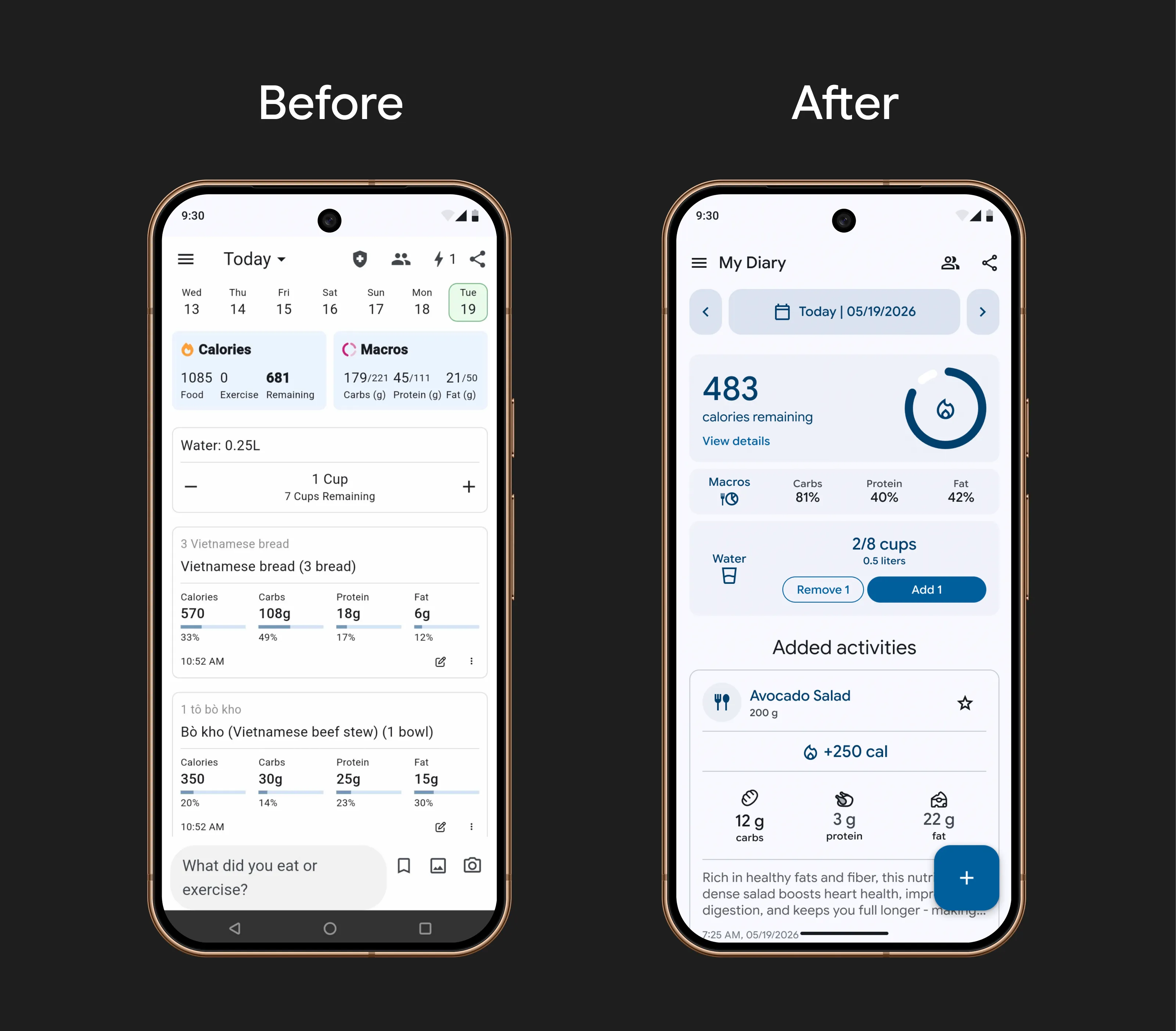
- Separation of concerns - Moved the input field into a dedicated “New Entry” screen. The goal was to separate consumption (e.g., viewing stats/summaries) from creation (e.g., logging meals/activities), which helped reduce cognitive load.
- Immediate core metric - Redesigned the overall layout to highlight what users want to know the moment the app loads, specifically the remaining calorie allowance for the rest of the day.
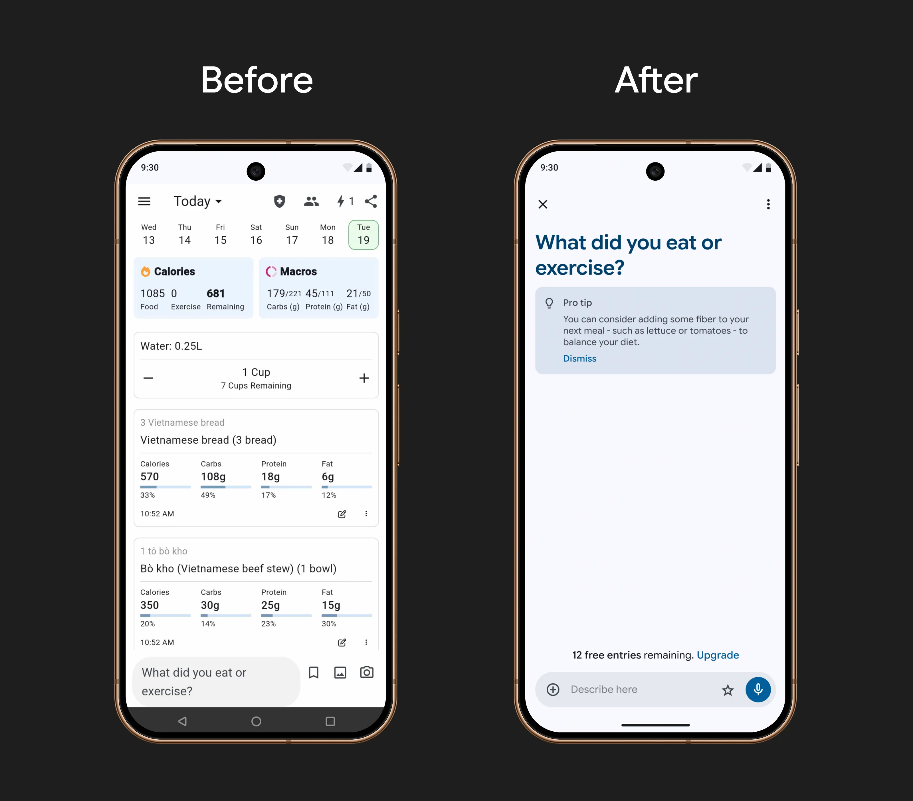
- Contextual trial status - Added the free trial status label directly to this screen so that users can keep track of their remaining credits right before they submit an entry.
- Clearer suggestions - While the original app included history suggestions, it wasn’t clear how to interact with them. I moved them to a separate block with tappable rows so users can easily tap and autocomplete frequent prompts.
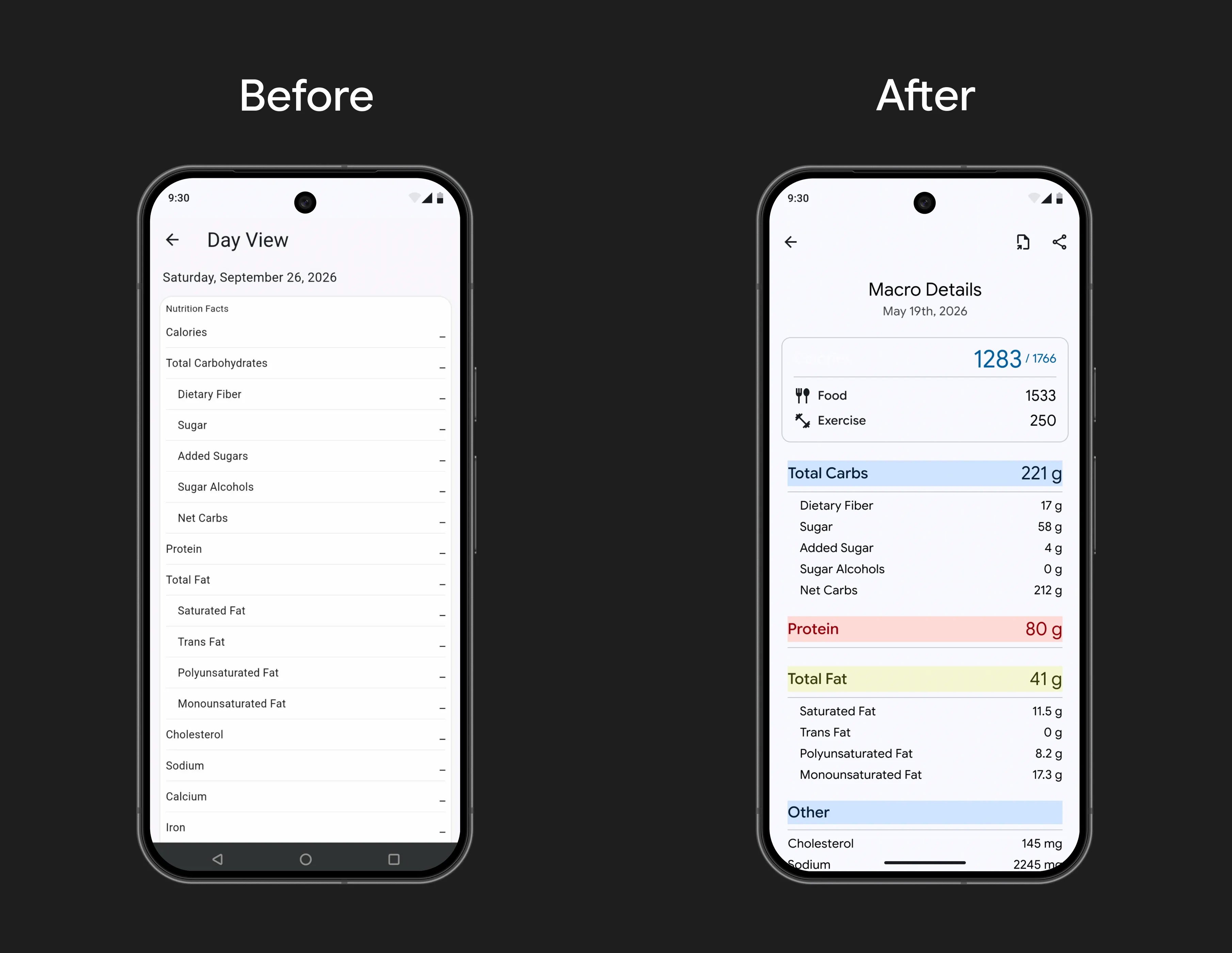
- Structured visual hierarchy - The original app's Day Details screen puts all macronutrient values in a single table with no distinction in importance. I organized them into smaller groups of related values to improve scannability.
Future Work
Usability testing is needed in order to see how my approach can match or reduce task-completion time compared to the original app. Additionally, the explicit trial label could be iterated in different ways instead of showing the credit count every single time. For example, users can be notified of their remaining credits at specific milestones rather than on every entry.
Key Takeaways
Being ambiguous about the free trial could also have been an intentional decision by Journable’s team, as being too explicit about credit limits might cause users to leave the app before they even try sending their first prompt. My work here focuses solely on resolving the long-term trust problem that can easily be seen in user reviews. It takes more than just UI refinement to truly improve the end-to-end user experience, as these changes still require real user testing and metric validation to find the right balance for both the users and the business.